Comment

Do Ho Suh

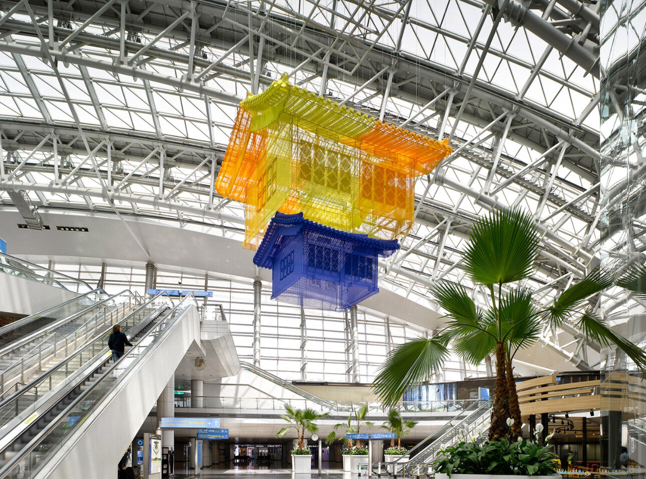
Do Ho Suh, 'Home within Home,' 2019

Sacred Spaces In Public Places

written by Marcus Masaki

In my childhood I attended a church. I would sneak away to be in the stairwell, a tall rectangular room with carpeted blue floors. I would sit on the steps, knees to my chest, and listen intently to the muffled voices of the churchgoers next door. It was solitude, but more importantly it was a way to observe without being observed in return. Had the room been made of translucent fabric and wiry threads, that wouldn’t have been possible. In that sense Seoul-born artist Do Ho Suh’s work confronts you with the knowingness and willingness to be perceived. The structures consent to be looked at, but they look at you too. 

Suh works to document a personal mythology built on the framework of memory and domestic spaces. He constructs life-sized immersive installations composed of colorful polyester fabric to replicate physical spaces that are of personal emotional significance. These projects are tangible, anatomical constructions built on invisible yet familiar experiences. The precision and attention to detail in Suh’s works are akin to 3D architectural blueprints displayed before the viewer. Its timelessness and fortification of safety and security wherever you go is evident as visual line weight is reinforced by the varied thicknesses of the seams throughout the structures. The fine texture of the fabric is tightly stitched together in grids. When stepping back, the texture nearly vanishes and viewers are left with the presence of smooth translucent structures. The installations retain their sharp angles and imposed rigidity, yet they reconcile with the natural gravity of fabric, susceptible to ripples and curling. 

It makes it so real. The constructions of fabric projected in front of the audience mimics a room or home one could easily step into, yet remains delicate in material. The gossamer buildings become monuments to nostalgia. It begs the question if the memories that they allude to are as prone to tearing as the artwork itself.

In an attempt to domesticate the memory, Suh crystalizes the points in time in which the space existed, exists in the present, and will exist in the future.  His personal history becomes a shared public experience, inviting guests into the not-quite-solid abodes lingering in his mind. The relationship between time and place is inherently woven with each careful stitch. In terms of forming complicated attachments to physical interiors/exteriors, it relates to memorializing and honoring a singular space through stillness. However, in a more intuitive sense, it relates to the philosophy of time not being linear. When you think of a happy or sad memory, your brain remembers the physical feeling of that time. There’s this sense of transporting backwards and surpassing the mental barrier of ‘today’ and ‘this morning.’ You always go back.  

Do Ho Suh (3).jpg

Though most of us just glance back, Do-Ho Suh turns around and holds a steady gaze into the past. Carefully documenting and measuring the physical spaces he wishes to contain--it’s a very meditative practice. And it’s one fueled by a lot of love and appreciation. Art is something that can require patience, and it’s a practice that fewer people would do if they didn’t genuinely love the process and outcome. It’s clear that he loves and wants to honor the spaces that he’s been in. In the process, he becomes a part of it. It’s an act of loving the self through the other. 

It’s surgical and it’s loved. It’s dissected and sewn together and complete, if you ignore the emptiness.  


Marcus Masaki Rodriguez was Torrance Art Museum's Getty Marrow Undergraduate Intern for Summer 2021. He wrote this article as a part of his internship experience.


Comment

Comment

Nan Goldin

Nan One Month After Being Battered, 1984

written by Hope Ezcurra

We had driven the museum van out to the desert to return an artwork, to a collector who had loaned our institution the work for a show. After the head prep and I had rehung the work and the collector had signed the paperwork releasing the work back to them, they had noticed us looking at the incredible artwork in their home and asked us if we had time and would like a brief tour of their collection. She and her husband had amassed a museum quality collection of contemporary artwork: John Baldasari, Marina Abramovic, Cindy Sherman, and Paul McCarthy to name just a few. Walking through her home was impressive, but what has stayed with me since then, almost a year later, was the Nan Goldin print, from the mid-80s, that she had hanging in a spacious secondary bathroom.

Nan Goldin, Misty and Jimmy Paulette in a taxi, NYC, 1991

Nan Goldin, Misty and Jimmy Paulette in a taxi, NYC, 1991

Previous to this encounter, when I thought of Nan Goldin, I had thought of her photograph, Misty and Jimmy Paulette in a taxi, NYC, in which she had photographed two drag queens in the back of a NYC yellow cab.  I had respected her work for the frank and honest light with which she captured people. In the case of Misty and Jimmy Paulette, she had looked at these two marginalized members of society at the height of the AIDS epidemic, and in her photograph captured not only their glamour but their pathos; the viewer sees fully realized human beings with hopes, dreams, and fears. 


I was unprepared for the photograph that I was about to be confronted within the collectors home though. I use the word confronted as this photograph is absolutely confrontational. It is not an easy or comfortable work of art. Its power is in its ability to discomfort. Nan herself stares directly at the camera and at the viewer. You are eye to eye with her, her left eye still blood red and the orbital discolored and distended from the abuse that she had suffered. Standing in front of it for the first time, the thought of what Nan must have experienced for her face to look like this made me want to look away, but I was caught in the tractor beam of her gaze. The photograph at first appears to be simple documentation, but as I continued to gaze at the image, layers of meaning, nuance, and intelligent composition unfolded. Nan Goldin made many deliberate choices when crafting this image that serve to elevate this photograph from documentation into a layered and significant piece of artwork.

Nan Goldin, Nan one month after being battered., 1984

Nan Goldin, Nan one month after being battered., 1984

The first detail that one's attention is called to, after the viewer is able to disentangle themselves from the physical damage to Nan’s face, are her red lips. She precisely applied a rich and vibrant shade of red lacquer, creating an unsettling incongruence with the rest of her mangled face. There are many layers of meaning that can be read into this detail. The lipstick itself suggests traditional female tropes of beauty and societal constructs of gender. Both concepts that could be seen as having correlations with domestic violence against women, a dissonance with the aftermath of violence presented in the image. There is a suggestion that while her lips are beautified by this lacquer, that her damaged eye in it’s beaten hues, is somehow also sexualized in a strange way, by the hematomas and hemorrhaging in and around them, correlating dominance, control and abuse. The evidence of her survival, instead of making her ugly, creates a strange asymmetrical grace. Her survival and strength gives her back the beauty that the brutality to her face had taken away . The lipstick plays a compositional role in her photograph as well as a conceptual one. The red of her lips creates a push and pull with the blood red of her eye, and guides the viewer to look at the entirety of her face, not only the most severe damage on it. Her beautiful red made-up lips, that would be considered traditionally beautiful, create a sharp and elegant contrast with the evidence of savagery in and around her eyes. 

The second detail that I notice when looking at this image are her pearls and earrings. This, alongside the lipstick, suggest to the viewer that the image is staged, that while the bruising is real, Nan is elevating her trauma into artwork. These details inform the viewer that while there is an element of documentation in the image, that Nan as an artist is offering up her pain as a way to create connections about power, brutality, violence towards women, sex, intimacy, and traditional gender roles with her work. This image is not exploitive of her pain. As a woman, jewelry is something that I put on when in public, so although this is a very intimate and confrontational image, her wearing jewelry reflects a sense of intention for it to be public discourse.  They are the silver platter on which she is serving her suffering to the audience. The jewelry also plays a role compositionally, as they frame her face and draw an additional gentle attention to the focal point of the photograph. 

Lastly the background also plays an important role conceptually and compositionally. She chose to take this photograph in front of embroidered curtains, which suggests a domestic setting. The idea of domestic safety is torn to shreds by the presentation of her face. It also suggests that the violence was of an intimate nature, that it occured in the home by someone she cared for. It again calls into question societal tropes of femininity and gender roles. The embroidery is delicate and pulchritude, traditionally female characteristics; it suggests that this violence was perpetrated not only as an expression of anger, but as an expression of dominance. 

The background is also a clue to a wise photographic choice that Nan made. The background is obviously white, but reads in the image as green. This is evidence that she either used film, added a filter, or used a light that had green tones to it. This is a very smart use of color theory, as red and green are opposing to one another, hence intensifying each other. The red of her eye and lips is intensified by the green undertones in the image. Also the undertone helps establish visual interest and depth to the image as the warm colors on her face reach the viewer before the cooler green tinged background and breaks up the image into near symmetrical vertical thirds that are visually pleasing. Nan used color theory and spatial composition to create an image that is elegant while also unsettling and brutal.

The same humanity and pathos of Jimmy and Misty, that she was able to capture in the back of the cab, she lets the viewer see in herself. The pain is obvious, but you can also see the strength she has in bearing this trauma to the viewer. She is confronting the viewer, society, and her abuser. While her face is stoic, her right eye, that did not suffer the same trauma as her left, expresses a gamut of emotions. It expresses her humanity, and through this shared humanity, the viewer, perhaps never a victim of abuse themselves, can connect with her. She is not just a statistic of domestic abuse, she is a human being that feels the same emotions that we all do, and that still resonates decades later. 

My measure of great artwork is: does it make you think and does it make you feel? This photograph of Nan - broken, bloodied, sad, yet resilient and strong - passes the test.


Comment

Comment

Jenny Brosinski

jennybrosinski-plus-onegallery-5-1440x960.jpg

Jenny Brosinski written by Max Presneill

Jenny Brosinski is a Danish artist based in Berlin. I decided to write about her as I personally feel her work has a similar aesthetic to some of my own paintings and because I feel she successfully manages to deal with a form of painterly minimalism with a freedom and exuberance that I can only rarely attain.


She integrates gestural abstraction, text, spraypaint and collage on larger scale canvases, and other support materials, to conceptually engage with both the nature of the materials being used, the methodologies of interpretation and a construction of meaning. Misleadingly simple in appearance her paintings utilize household cleaning supplies in conjunction with art materials to produce art works that are highly complex, in aesthetic sensitivity, formal composition and intellectual rigor.


Reductivist in identity they still overflow with potential. They are in the act of becoming, a liminal state between what the artist has left and what we finish by observing. The paintings track their own process of construction while revealing very little directly. One needs to actively engage with interpretation, making the viewer an accomplice rather than a passive onlooker. This self-reflexive awareness of the artist-at-work presents not a fait-accompli but the knowledge of the on-going and potentially disastrous results of this kind of work. It reflects its own risk taking. It is brave work. 


Aspects of production become part and parcel of the painting - what to add, when to stop working on it. This helps us to understand this as an experiment. A trial and error process, not picture making with a pre-decided image being created. The titles, as well as imbedded textual elements on the picture plane of the work, sometimes display what seems to me a sense of humor and often personalize the painting - both rejecting our easy entry to their meaning, reminding us that a forever distanced subjectivity is our lot - but also linking us to possible readings, of acknowledging the relationship between word and image.


They trace their own organic growth and so mirror ourselves, our lives, time passing and therefore a state of entropy and aging. Their mark-making and gestural brushstrokes emphasize her presence and thus our own mortality is recognized and looks back at us, while they still seem somewhat joyous, to celebrate that they are.


Bold color and generous movement pull our visual attention in and the subtleties of mark keep us there. There is a playful unconsciousness revealed here but this does not reject the art-historical interaction that her conscious and learned knowledge also brings to bear. Although the artist is seeking an emotional response from the viewer, which she deftly achieves, she also demands an intellectual one too. Her relationship to the history of abstraction is apparent. Her differences from it too. The deliberately awkward scrawls may reference the scratchings of children but they are a sophisticated realization of the power of marks, their presence in our lives from birth to death, from doodles to graffiti, from poetry to documents and declarations. Hers are non-specific but ever present.


In the end they hold an optimism for me. They are an endless possibility. They are potential - they are fluid, transient, a self aware moment in a stream of alternatives and avenues of investigation. Her art is always fascinating to me and an inspiration.

For more information on Jenny Brosinski, please visit: jennybrosinski.com

Comment

Comment

Hank Willis Thomas

Strike, 2018, Stainless steel with mirrored finish

Strike, 2018, Stainless steel with mirrored finish

Hank Willis Thomas - written by Jason Jenn

Hank Willis Thomas needs to be a household name in the realm of contemporary art. I trust it will be soon, thanks to an impressive body of prescient works in recent years that address some of the weightiest subjects we face today. Thomas is a conceptual artist who reframes pop-cultural and historical imagery with a clean, clear graphic aesthetic that tackles themes like racial injustice, gender and racial inequality, gun violence, and corporate branding. There is no mistaking his message's intent when it's delivered with such stunning, visceral results.

HankWillisThomas_14%2C719.jpg

I experienced a wide breadth of his work in Portland Art Museum's exhibition All Things Being Equal…, his first major museum mid-career survey just before the pandemic outbreak in January of 2020. Thomas' principal medium for expression is photography (he received his BFA and MFA in Photography –and his mother is a professional photographer with her own acclaimed career). However, in the past 25 years, he has created an eclectic body of work, including sculpture, mixed media, installation, video, and participatory performances. He also works on various interactive and collaborative projects to inspire public conversations about social justice and civil rights.

One of the first works on view was an immersive installation that created a shrine-like circle of long, dark blue banners embroidered with 14,719 stars evoking the American Flag, referencing the number of people shot and killed by gunfire in the United States in 2018. The work reflects one of the most shocking statistics of American culture that continually avoids being addressing by serious solutions. Thomas experienced a devastating loss firsthand. In 2000, his cousin (also his roommate and best friend) was killed by gunfire in a robbery outside a nightclub in Philadelphia. Like most of his works, he finds a way to resonate with everyone because he deals with such culturally pervasive issues.

"But all you have to be is alive in America and you can fall victim to gun violence."

– Hank Willis Thomas

Thomas uses the language and design of advertising to communicate his message – he does not go for vague or subtle, and he does not pull his punches. He frequently explores how commercial/consumer brands exploit and profit from stereotypical images of the black experience.

Guernica, 2016,  mixed media including sports jerseys

Guernica, 2016, mixed media including sports jerseys

The Cotton Bowl, from the series Strange Fruit, 2011. Digital c-print

The Cotton Bowl, from the series Strange Fruit, 2011. Digital c-print

He frequently critiques commercial sports, and in recent years it has become more apparent how the industry can use black men while being indifferent and hypocritical to racial issues. In his series B®anded, Thomas transforms the iconic Nike swoosh logo into a literal brand scarring the bodies, referencing the branding of slaves by their owners. He created quilted versions of Picasso's Guernica and Matisse's The Fall of Icarus, made out of bright, colorful familiar sports jerseys from teams like the Lakers and Knicks. It forces the viewer to question how the ideas of war and sacrifice in the original works relate to the challenges faced by professional athletes and the conditions they must endure to entertain the masses.

Raise Up 2014, bronze

Raise Up 2014, bronze

His sculptural work takes iconic imagery from historical photographs, isolating the most potent elements that stood out for him and transposing them into three-dimensional works that crop out everything but the essential focus. The results are chilling and monumental.

While nothing compares to the reality of visiting a museum in person, digital media becomes even more critical during shelter-at-home. The Cincinnati Art Museum created a gorgeous exhibition video walk-through, narrated by Thomas that is worth checking out:

https://www.cincinnatiartmuseum.org/hankwillisthomas

Commit the name Hank Willis Thomas to memory and when you have the opportunity to see his work, consider it a necessary experience.

Hank Willis Thomas, Looking for America, 2018. Bronze and steel.

Hank Willis Thomas, Looking for America, 2018. Bronze and steel.

Comment

1 Comment

ALEX DONIS

Alex Donis / Officer Moreno and Joker, 2001 / From the series: WAR / Oil and enamel on plexiglass
 /41" x 28" / Private collection

Alex Donis / Officer Moreno and Joker, 2001 / From the series: WAR / Oil and enamel on plexiglass
 /41" x 28" / Private collection

Alex Donis - written by Jason Jenn

Art provides many functions in contributing to the overall health of a community, including the thoughtful critique of its various systems and institutions. It can reflect the harsh realities of complex situations and offer up a new vision of possibility. That’s part of what makes the works of Alex Donis, like Officer Moreno and Joker among my all-time favorites. Donis is known for his portrayals of peaceful, playful comradery and/or love between typically historical adversaries. It’s a beautiful, timeless concept; imagining what could be if humanity could set aside their differences.

However, transforming enemies into friends and lovers is a daunting task - as we surely understand in this day and age. The concept is easier said than done, and easier portrayed in art than actualized in reality. But the hope and effort to make it possible matters. It’s only by pushing the cultural boundaries of expectations that we make progress and expand our collective understanding, but there’s often a lot of push-back. The creation and exhibition of such artwork can attract a lot of ire in the process of sharing. 

Since “toppling societies’ conventional attitudes…influenced by a tri-cultural (Pop, Latin and Queer) experience” is part of his artistic statement, Donis is no stranger to controversy in his career. His exhibitions have often been subject to vandalism and/or threats. His 1997 exhibition at Galeria de la Raza in San Francisco portrayed iconic same-sex figures kissing each other, like that of Che Guevara with Cesar Chavez and popstar Madonna with Mother Theresa. The installation was vandalized twice within two weeks of its opening. In 2001, his exhibition WAR at the Watts Tower Arts Center was pulled down/censored a mere three days after its opening by the LA City Cultural Affairs Department when members of the Watts community threatened vehement protest. The gay thematic tones coupled with the tense history of gun violence hit a sensitive spot in its depiction of LAPD officers engaged in same-sex dance poses with gang members. It’s hard to know which of the two controversial issues was more difficult for the community to see on view in the art, but one can certainly speculate.

Twenty years later, Donis’ works are as relevant as ever. They remind me what it could be like if more people in the world were lovers, not fighters. Dancing certainly looks more fun. 


“My work for many years has been to understand hatred in society and how, as an artist, to dissolve it by bridging vast social divides.” - Alex Donis (WAR Press Release, September 27, 2001)

Sgt. J.J. Wilder & Cpt. J.D Butler (Giselle) US Civil War, 2006 / From the series: Pas De Deux / Oil, ink, & enamel on canvas / 36" x 36"

Sgt. J.J. Wilder & Cpt. J.D Butler (Giselle) US Civil War, 2006 / From the series: Pas De Deux / Oil, ink, & enamel on canvas / 36" x 36"


1 Comment

Comment

I AM A MAN

One March, Four Works of Art

written by Hope Ezcurra

Glenn Ligon, Condition Report, 2000, Iris print, screen-print, diptych, each: 811 x 576 mm

Glenn Ligon, Condition Report, 2000, Iris print, screen-print, diptych, each: 811 x 576 mm

In 1968 sanitation workers assembled in front of Clayborn Temple on the streets of Memphis, Tennessee, for a solidarity march carrying, now iconic, signs that read “I Am A Man”. The workers were inspired by the prologue to Ralph Ellison’s seminal work “Invisible Man”.

“I am an invisible man. No, I am not a spook like those who haunted Edgar Allan Poe; nor am I one of your Hollywood-movie ectoplasms. I am a man of substance, of flesh and bone, fiber and liquids -- and I might even be said to possess a mind. I am invisible, understand, simply because people refuse to see me. Like the bodiless heads you see sometimes in circus sideshows, it is as though I have been surrounded by mirrors of hard, distorting glass. When they approach me they see only my surroundings, themselves, or figments of their imagination -- indeed, everything and anything except me.”

  • Ellison, Ralph. Invisible Man. 2nd ed., Vintage Books, 1995.

By omitting the word "invisible”, the Memphis strikers asserted their presence, while still referencing the cultural and legal alienation Ellison expressed in his work. This march would end up becoming an important part of the attack on the legal framework of the Jim Crow Era.  The workers were protesting horrible working conditions and racist discrimination by the sanitation department and city. The protest had been sparked by the criminally unsafe conditions that had led to the death of two of their ranks 7. It would become an iconic moment in the civil rights struggle. Research would suggest that its significance in American history is due to four distinct yet interwoven factors. The first being, that although the strike and marching was drawn out, it ended up being successful, becoming an example for all minorities experiencing race related work place discrimination. Secondly, solidifying its place in the history books, it was the last march led by Dr. Martin Luther King before his assassination in April 1968. Some historians even argue that it led to his death 6. Thirdly it is a powerful example of the collective bargaining power of unionizing. And finally, perhaps the reason that the imagery has an almost memetic quality to it, is the slogan’s marriage of simplicity and poignancy. “I Am A Man” expressed so much in so few words. Graphically the stark contrast of the bold black lettering against the bright white background emphasized the slogan and the fact that almost all the 1,300 men were carrying the same sign drove home the significance of it. 

While the moment itself was incredibly important historically and politically, the following four works of art, of it and about it, themselves carry substantial cultural weight.  

The first two artists to capture this historic moment were a pair of photojournalists. Through their art, they took what is an important march of the civil rights movement and made it iconic. It is interesting to look at how visually and thematically distinct their images of the same event are.

Ernest C. Withers, I Am A Man (from the portfolio I Am A Man), 1968, Gelatin-silver print

Ernest C. Withers, I Am A Man (from the portfolio I Am A Man), 1968, Gelatin-silver print

Perhaps the most famous image captured that day is by Ernest C. Withers. He is one of the best known African-American photographers of the civil rights movement and the segregated South 10. His most often reproduced image of the day is a testament to his excellent eye for composition. The black and white photograph captured a street flooded by striking workers, most if not all carrying the stark white sign with black typeface declaring “I AM A MAN”. The shot was taken on eye level so the melanin of the strikers faces and dark colors of their clothing create a bold horizontal line that cuts across the image. The row of people accentuates the sea of identical signs held aloft. The color of the sky and the pavement on the film Withers was using is incredibly similar, emphasizing the elegant symmetry of the image. A lone man faces the camera as he crosses in front of his fellow protesters, captured slightly off center of the image. As shown in this image, Withers' use of proportions create elegant visual tension in his artwork.

Richard L. Copley, I am a man, 1968, photographic print

Richard L. Copley, I am a man, 1968, photographic print

In 1968 Richard L. Copley was just starting out in his photography career 8, and although his most published image of the day does not have the sophisticated composition of Wither’s work, it has its own strengths. It is a much closer shot, allowing the viewer to make out the individual faces of the sanitation workers captured in frame. A resolute steadfastness can be seen in many of the men. While there are fewer signs in the image, they still dominate the upper ⅔ of the photograph. The strength in this work of art comes from the fact that one is able to see the distinct features of every person visible in it, driving home the signs' message. The humanity, which the strike was defending, is physically visible in Copley’s image.

The superficial simplicity of Glenn Ligon’s 1988 Untitled (I Am A Man) conceals a depth of meaning. Glenn Ligon, the important African-American conceptual artist, is well known for his text based work. His artwork often examines race, identity, and the cultural implications of American History. He painted “Untitled (I Am a Man)” very early in his career, and it is a testament to his brilliance as a conceptual artist. The first thing that one notices when looking at the painting side by side with the photographs of the original signs is that the arrangement of the words is different. One may also notice that the spacing is different as well as the size of the letters in proportion to the white space they are in. Unless the viewer has a photographic memory or is a civil rights historian, the differences only appear when looked at side by side. My interpretation of this is that Ligon is making a commentary not only about the racism, past and present, in our country but also our memories of it. “Untitled (I Am a Man)” is fine art proof that we are all unreliable narrators. The subtext that I see develop below the overlapping surface themes of race, identity, and culture is the importance of maintaining an open mind to how other people experience the world around us.   

Glenn Ligon, Untitled (I Am a Man), 1988, Oil and Enamel on Canvas, 40 x 25 inches

Glenn Ligon, Untitled (I Am a Man), 1988, Oil and Enamel on Canvas, 40 x 25 inches

Hank Willis Thomas’ re-interpretation of the sign creates an important dialogue about African American identity and the historical factors that have shaped it. He presents his conversation as twenty framed paintings each with a slightly different play on the original “I Am a Man” slogan. The first piece references the Three-Fifths Compromise in the constitution. Thomas makes sure that his meditation on identity doesn’t omit the history of slavery. While his 2009 “I Am A Man” work confronts the viewer with the cruel reality of bondage in our country’s past, it also provides hope. The last two frames of the series read like a prayer, closing with the word “Amen”. The work, between, flows like an improvised jazz song. It can be read as poetry, a hymn, or stream of consciousness. I particularly like the one that states “I AM MANY”. I read it as not only are there many black men like the artist but there are also many people that believe and hope that our society can be better. Willis presents the viewer a painful yet yearning reflection on not only his identity but the shared one of all Americans.   

In a country that still celebrates Confederate general Robert E. Lee's birthday in multiple States 9 it is important that we consider the lessons being offered by this group of 1960s sanitation workers. We would do well to remember the meaning of their slogan held aloft in gorgeous black and white photographs and reproduced in powerful contemporary art. “I Am a Man” will continue to be an important reminder to have empathy for the history of violence, discrimination, and persecution that minorities have faced in this country and to continue striving for equality. 

Hank Willis Thomas, I Am A Man, 2009, Liquitex on Canvas 55 1/2 x 228 x 2 1/4 inches

Hank Willis Thomas, I Am A Man, 2009, Liquitex on Canvas 55 1/2 x 228 x 2 1/4 inches

Citations: 

  1. Brown, DeNeen L. “'I Am a Man': The Ugly Memphis Sanitation Workers' Strike That Led to MLK's Assassination.” The Washington Post, WP Company, 12 June 2020, www.washingtonpost.com/news/retropolis/wp/2018/02/12/i-am-a-man-the-1968-memphis-sanitation-workers-strike-that-led-to-mlks-assassination/.

  2. Carson, Dr. Clayborne. “Memphis Sanitation Workers' Strike.” The Martin Luther King, Jr., Research and Education Institute, Stanford University , 4 June 2018, https://kinginstitute.stanford.edu/encyclopedia/memphis-sanitation-workers-strike.

  3. Copley, Richard. “The Struggle for Dignity: Martin Luther King Jr.'s Last Battle in Photos.” ABC News, ABC News Network, 4 Apr. 2019, abcnews.go.com/US/struggle-dignity-martin-luther-king-jrs-battle-photos/story?id=54041075.

  4. Eschner, Kat. “Some States Celebrate MLK Day and Robert E. Lee's Birthday on the Same Day.” Smithsonian Magazine, Smithsonian Institution, 16 Jan. 2017, www.smithsonianmag.com/smart-news /some-states-celebrate-mlk-day-and-robert-e-lees-birthday-same-day-180961772/.

  5. Speri, Alice. “The Double Life of Civil Rights Photographer and FBI Informant Ernest Withers.” The Intercept, First Look Media, 28 Feb. 2019, https://theintercept.com/2019/02/28/ernest-withers-book-bluff-city/.

Comment

Comment

Nick Cave

4-reasons-to-collect-nick-caves-soundsuit-photographs-900x450-c.jpg

Nick Cave - written by Jason Jenn

I have a confession to make: when I went to see the exhibition Meet Me At the Center of the Earth, by the artist Nick Cave, I totally thought that the rock and roll frontman of the Bad Seeds had somehow ventured into the visual art world. I’m at least relieved to know from talking to others that I wasn’t alone in my confusion of the two, nor am I the only one to be immediately captivated by the artist’s imaginative and playful fusion of assemblage, fashion, sculpture and performance art. It’s one of the few occasions where even though while on vacation, I nabbed up one of the heavy photographic tomes for sale in spite knowing I would have to travel around with that extra weight. I simply had to keep examining his body of work for hours after the visit.

There’s a lot to enjoy in Nick Cave’s creations. Cave’s experiences as a dancer with Alvin Ailey come into play watching how they move both in a studio or out in the world in various locations. The Soundsuits in particular are full of life whether viewed in action while worn by a performer or when simply standing still displayed on a mannequin. The eye of the beholder is constantly engaged in its own dance as it takes in each piece, full of intricacies, layers and new surprises. 

Shainman-NickCave3-NC15.025-Soundsuit-HR.jpg

The Soundsuits are composed from a wide variety of materials, such as buttons, beads, yarn, feathers, hair, fabric, fur, fake flowers, old toys, household items, discarded objects, etc. Cave combines and transforms everyday objects into breathtaking creations. They take inspiration from African art traditions and various ceremonial dresses and armor, with visual similarities to some Mardi Gras Indian suits and nods to the outlandish fashion and living sculptures of artist Leigh Bowery (another favorite of mine). The Soundsuits astutely bend the principles of haute-couture fashion, allowing Cave to utilize his childhood background repairing hand-me-down clothing alongside his fine arts degree and studio practice. The Soundsuits completely morph the wearer obscuring their identity - age, gender, color, body shape - are all hidden from the beholder as part of the artist’s intention to do so. He wants the viewer to look without judgment or prejudice. 

The origins of Cave’s Soundsuits come from a social tragedy that is still hauntingly relevant: the brutality witnessed during the Rodney King beatings by the LAPD in 1992. 

“I started thinking about myself more and more as a black man – as someone who was discarded, devalued, viewed as less than. I started thinking about the role of identity, being racially profiled, feeling devalued, less than, dismissed. And then I happened to be in the park this one particular day and looked down at the ground, and there was a twig. And I just thought, well, that’s discarded, and it’s sort of insignificant. And so I just started then gathering the twigs, and before I knew it, I was, had built a sculpture.” - Nick Cave, 

da01f111a5ac0d1d9c14e9022da77455.jpg

From that initial twig and wire Soundsuit, Cave has gone on to create over 500 Soundsuit creations across the world. He often works with various non-profits, social groups and community organizations, guiding others in a process of making their own creations based on found objects within the region. These workshops become powerful community resources, and are in line with the inherent ceremonial and shamanic potentials within the shapeshifting Soundsuits. He’s a great example of using art and creativity to heal and transform pain within a community and to bring people together for a social cause. We can take inspiration from his body of work to help creatively navigate and address the ongoing wave of contemporary social issues.

6b4baf30994099a88c7e15fa77c0e861.jpg

Comment

Comment

Kehinde Wiley

Cunningham-Obama-Kehinde-Wiley.jpg

Kehinde Wiley - written by Hope Ezcurra

There is a strong thematic element that has connected presidential portraits from George Washington's, our nation's first president, through to George W. Bush, our 43rd president 222 years later. The official portrait has been a tradition since 1796, generally an oil painting, nearly always standing in an office or official chamber, resolute looking, always a white man painted by a white man.

And then came Obama, the first US African American president, and convention was thrown gorgeously out the window. His portrait was painted by Kehinde Wiley, the first African American to paint a presidential portrait. But not only is it significant of who it was painted and by whom but also how it was painted. It is a riotous explosion of life. The official chamber was instead traded for a wall of  lush green leaves, speckled with the occasional flowers from Chicago, Hawaii, and Kenya. Obama exists floating on a different plane than the foliage, but his plane intersects with the leaves near his feet. He sits on a chair that is vaguely regency style, borrowing design motifs from both the 18th century and turn off the 20th century. His pose conveys both power and tranquility. The color saturation of Obama's skin is so strong that it suggests the vision of a tetrachromat; it is a love song to his melanin almost as if his flesh was lit from within. 

The only homage to traditional presidential portraits is Obama's expression, he too stares resolutely at the viewer, with the exception of Kennedy's downturned gaze painted after his assassination, Kehinde Wiley did not break with that convection.

Screen-Shot-2016-12-18-at-2.20.36-PM.png

Homage to convention, is a theme that runs through Kehinde Wiley's glorious celebration of modern black men and women. Not only does he honor by overturning the conventions of traditional portraiture by seating a dark skinned person at their center, but also pays his dues to the classic imagery of Hip-hop culture and material trappings of blackness in America. He paints his subjects naturalistically, almost always in grandiose classical possess against or in lush backgrounds of leaves or plants. They often emulate thematic elements of William Morris textiles, drawing parallels with old regency homes. Born in South Central Los Angeles in 1977, and now based out of New York; Wiley attended the Art Institute in SF and got his MFA at Yale. His paintings are both a love letter to his subject's blackness and the imagery of classical portraits. He is gifting his subjects the same regal power that was denied to their ancestors, notably absent from the portraiture he evokes. While it is done in a way respectful of the artistry he subverters, the visual tropes he utilizes speak both to power and elegance as well marginalization and discrimination, both historical and in our present day world. Speaking on his yellow wallpaper series he said that he focused on "correlations between the sense of powerlessness and the sense of invention that happens in a person who’s not seen, who’s not respected and whose sense of autonomy is in question,”. His artwork is a luxuriant commentary on race, power, the history of art, and representation. 

Jacques-Louis-David-Le-Premier-Consul-franchissant.jpg
2015_Kehinde_Wiley_L2005.6_1397W_600_644.jpg
Théodore-Géricault-The-Charging-Chasseur-1812-the-Louvre-785x1024.jpg
Kehinde-Wiley-Officer-of-the-Husars-2007-Detroit-Institute-of-Arts-987x1024.jpg

Hansen, Michele. “About That Chair In President Obama's Portrait.” Medium, Medium, 21 Feb. 2018, medium.com/@mjwhansen/about-that-chair-in-president-obamas-portrait-56f07617efe4.

“Presidential Portraits.” The White House Historical Association, The White House Historical Association, www.whitehousehistory.org/galleries/presidential-portraits.

Wrathall, Claire. “Kehinde Wiley: 'I Took the DNA of William Morris and Created Hybrids'.” The Guardian, Guardian News and Media, 25 Jan. 2020, www.theguardian.com/artanddesign/2020/jan/25/kehinde-wiley-william-morris-exhibition-interview.

Comment

Comment

The NEA Four

THE NEA FOUR - written by Jason Jenn

Government funding for the National Endowment for the Arts has experienced controversy since its creation in 1965, and the recent allocation of $75 million to the NEA placed in the Covid-19 relief package once again stirred up some animosity toward the program. As both an artist and art-lover, I appreciate the recognition of the arts for federal relief during this time of crisis, yet find it still not enough. After all, the arts in general contributed $877 billion to the U.S. economy in 2017 with over 5 million people employed within the arts and culture sector earning $405 billion. The war operations in Afghanistan, Pakistan, and Iraq have created $6.4 trillion of financial obligations/debt. So is $75 million dollars in crisis aid to fund the arts really worth raising a fuss over? Putting aside the immeasurable cultural value and the numerous scientific studies that show how important the arts are for mental development, those financial figures alone should satisfy ​opposition to a proportionately small amount of money compared to what the arts delivers to the economy. Unfortunately it does not.

NEA4.jpg

The ongoing battle over funding the arts in this country reminds me of the infamous NEA Four case in the early 90’s. The NEA Four is the group name given to four performance artists (Karen Finley, John Fleck, Holly Hughes, and Tim Miller) who were originally granted NEA awards only to have them revoked by congressman and NEA Chair John E. Frohnmeyer after congress (spearheaded by Jesse Helms) passed a “decency clause” as criteria for the government to judge works. The four artists sued the government for wrongly turning down their grants. While the artists won their case in district court, it ultimately worked its way to the Supreme Court in 1998, which ruled that the government’s decency clause does not interfere with artist’s first amendment rights. The NEA had already had its funding severely cut by Congress, but after the court decision they did away with funding to individual artists altogether.

Karen Finley

Karen Finley

Sadly the biggest victims of all in the ongoing battle against NEA funding and the so-called “Culture Wars”, are not artists like those of the NEA Four, but the citizens of the United States who live in small, rural communities in great need of funding and access to the arts in general.

As a rural teenager at the time, I was slightly aware of the significance of the controversy as it made national news. Impressions formed in my mind by the events profoundly affected my own appreciation (or lack of appreciation in some cases) towards performance art - in my mind, and perhaps many others,  it would be permanently connected with “indecent”. The NEA Four situation came shortly after other enormously public controversies surrounding the NEA funding of money; $35K towards an exhibition which included the homoerotic photography of Robert Mapplethorpe and another $10K award to visual artist Andres Serrano who made Piss Christ (a photo of a crucifix submerged in the artist’s urine). Going to battle over a small amount of tax payer money being used towards such indecent works of art made for a good distraction from money spent on wars (an estimated $61 Billion for 1990’s Gulf War).

John Fleck

John Fleck

So just what was deemed indecent about the NEA Four? For the sake of brevity I shall limit my description of each performances to one sentence, which is rather like showing a one inch square section of 6’ X 8’ canvas painting. Karen Finley created a performance called “We Keep Our Victims Ready”, which involved stripping to the waist and describing sexual assault while smearing chocolate on her body ending with a poem about social isolation and the AIDS crisis. John Fleck’s work “Blessed are the Little Fishes” dealt with concepts of faith and religious authority, and involved an onstage toilet prop and live urination. Holly Hughes’ performance of “World Without End” served as a memorial to her mother, with concepts about the battle of the sexes, her father’s abusiveness, fast food culture and growing up in the suburbs. Tim Miller’s works focused on AIDS activism, challenged the Reagan Administration and medical institutions for contributing to the enormous death toll, and often involved a portion of time with the artist naked. 

One of the purposes of performance art is the unfolding of visuals and themes over time, allowing for viewers to process information and develop various thoughts and emotions about the work. Performance art is an experience that cannot be easily condensed or simply described, much in the way that words cannot replicate the visuals of a work of graphic art. There were many reviews from audiences who actually experienced the NEA Four’s works, that said the performances helped provide catharsis, acting as a communal therapy of sorts - an invaluable process that cannot be measured or easily replicated by other methods. I know for many peers viewing performance art is their church, and experiencing such works evokes similar feelings to a religious rite or ceremony, which many conservatives support. 

Hollyhughes.jpg

There is no question in my mind that the quickly enacted “decency law” of Congress in 1990 and the repeal of NEA funding was a thinly veiled attempt to silence LGBT activism and the complicated issues which the AIDS crisis brought up. Three of the NEA Four artists identified as LGBT and the fourth dealt with AIDS issues and sexual assault. There is a reason the motto Silence Equals Death was created. To censor such works of art as those of the NEA Four was a masked attempt to erase the opportunity for community healing and avoid dealing with the elements which plague society. It’s not a difficult stretch to see parallels with how the Nazi regime censored work they labeled Degenerate art.

Some felt that the amount of attention garnered by the NEA Four during the process ought to have been good for their careers, as there is no such thing as bad press except no press at all. It should be noted that along with the attention, the NEA Four received cancelled performances, hate mail, phone calls, and death threats by people who never actually experienced their work in person; just its labeling as “indecent” by some members of Congress. 

I do so enjoy beautiful, satisfyingly simple and seductive works of art, but I am equally capable of recognizing the immense value in complicated and controversial works of art that challenge our perceptions of the world. One doesn’t have to like a work of art to be capable of appreciating it. Performance art can be a powerful vehicle for expression, to hold a mirror up to society, illuminate important issues that need attention, and reshape our perspective. What constitutes “indecent” in one viewer's mind may be the exact emotional undercurrent another person is feeling that needs to be expressed. As the world grows ever more populated and problems mount, there are more and more festering wounds, which art has the potential to heal in ways not capable by any other means - if we give artists and arts organizations the opportunity and appropriate amount of funding to do so.

Tim Miller (center under Wilde sign with megaphone) at Protests in LA

Tim Miller (center under Wilde sign with megaphone) at Protests in LA

It should be noted that the NEA was originally created along with the National Endowment for the Humanities in 1965 under Lyndon B. Johnson’s administration to help improve the quality of life for Americans, particularly those in impoverished communities. They were formed during the era of the cold war space race, and there was a growing imbalance in the emphasis on the sciences - humanities and the arts needed some help in order to contribute to LBJ’s vision of The Great Society.


Comment

Comment

The VENUS

Venus by Hope Ezcurra

Venus by Hope Ezcurra

THE VENUS - written by Hope Ezcurra

Art is arguably the central expression of our humanity. Different cultures and time periods are often defined by the art that they produce. Yet for such a crucial aspect of civilization, it is a fairly young concept. Modern human beings have been on this planet for perhaps 200,000 years (1).

The earliest archeological evidence of human depiction in prehistoric sculptural art is perhaps 38,000-33,000 years old. She is a pneumatic, palm sized, female figurine. Without any written history to accompany her, one cannot say if she was made for ‘art for art’s sake’, ritual object or something else. 

venus of hohle fels.jpg

But no matter her utility, there is very obvious artistry involved in her creation. Her tiny head and feet are aesthetic anchors to the vertical momentum created by her corporeal midsection. She possesses a savage raw beauty. The Venus of Hohle Fels, as modern scholars have named her, is only the first in a cadre of similar statuettes from this time period. Over 200 other Venus figurines from the upper paleolithic, the last part of the early stone age, echo her appearance with almost memantic repetition. They all have exaggerated feminine features, are portably small (potentially a side effect of their owners’ nomadic lifestyles), and were made from extremely durable materials. 

The moniker comes from the original interpretation of them as prehistoric fertility goddesses. Sadly, without a time machine, there really is no way to know what they represented. This has not stopped scholars from speculating though; It has been postulated that they were “goddess figures, religious or shamanistic objects, or symbols of a matriarchal social organization”(2). The only thing that we can be certain of, based on their numbers, the repetitive imagery, and their long lasting construction, is that they were important to these people. 

My favorite of these so-called Venus figurines, is probably the most iconic of them, the Venus of Willendorf. She was found in present day Austria; now she is part of the permanent collection of the Viennese Natural History Museum. At 25,000 years old, she is one of the youngest prehistoric venuses. She and her Hohle Fels counterpart are separated by almost the same amount of time as we, in 2020, are to the invention of the wheel. Although there are obvious visual parallels between the two, the Venus of Willendorf shows a greater symmetry and a much gentler slope. My favorite design element though is that her face is blank. The fine detail work on her head covering shows me that whomever made her was capable of creating facial features, yet they did not. I can imagine two reasons for this choice. Either they did not want to pull attention away from the vertical flow they had created by tapering her at head and feet  and/or they wanted the sculpture’s  identity to be malleable to the needs of its beholder. So unless they left her face blank because they ran out of time, I find her blank face to be a great compliment to the visual intelligence of her maker. It's incredible to me that the artisan and I are separated by millenia yet we share similar inclinations. While we can not call her art with any accuracy, it would be subversive to the artistic intelligence that went into making her. I see reverberations of it throughout the history of art. 

venus.jpg

  1. Garber, Megan. “Confirmed: The Oldest Known Art in the World Is Spray-Painted Graffiti.” The Atlantic, Atlantic Media Company, 8 Oct. 2014, www.theatlantic.com/entertainment/archive/2014/10/humanitys-earliest-art-was-spray-painted-graffiti/381259/.

  2. Gotthardt, Alexxa. “Why Prehistoric Venus Figurines Still Mystify Experts.” Artsy Editorial, Artsy.net, 3 July 2019, www.artsy.net/article/artsy-editorial-prehistoric-venus-figurines-mystify-experts.

Comment

Comment

Francis Bacon

Francis Bacon - written by Max Presneill

Three Studies for Figures at the Base of a Crucifixion1944oil and pastel on Sundeala fibre boardtriptych, each panel 37 x 29 inchesTate Britain, London, UK

Three Studies for Figures at the Base of a Crucifixion

1944

oil and pastel on Sundeala fibre board

triptych, each panel 37 x 29 inches

Tate Britain, London, UK

Francis Bacon (1909 – 1992) was an Irish-born, British figurative painter.

He came late to art and dropped in and out of the art scene until Three Studies for Figures at the Base of a Crucifixion (1944), which made his reputation.

A lifelong drinker and gambler, a gay man when it was illegal to be so for much of his life, with a difficult family background, his work reflects a bleak image of humanity back at us.

PAINTING 19461946Oil and pastel on canvas77 ⅞ x 52 in. (198 x 132 cm)Museum of Modern Art, New York

PAINTING 1946

1946

Oil and pastel on canvas

77 ⅞ x 52 in. (198 x 132 cm)

Museum of Modern Art, New York

After the suicide of his long term lover, gangster George Dyer (the subject of many of his portraits), in 1971, Bacon increasingly reflected upon his own mortality, via self-portraits and more sombre settings, with darkened doorways becoming a motif, saying, “people have been dying around me like flies and I’ve had nobody else to paint.”  

Bacon’s central concern, placed front and center, was for the figure. Mostly taken from friends photographs, they reveal the transient impermanence of the flesh. Naked, base, animalistic, shorn of dignity or hope, carcass-like or deformed, they seem repulsive but captivating. Distorted, mutated, as seen through a drug haze or time warp, they are identifiable, but shift-phasing from one place/time into another with  some parts disappearing, others congealing. 

STUDY AFTER VELÁZQUEZ'S PORTRAIT OF POPE INNOCENT X1953Oil on canvas60 ¼ x 46 ½ in. (153 x 118 cm)Des Moines Art Centre, Des Moines

STUDY AFTER VELÁZQUEZ'S PORTRAIT OF POPE INNOCENT X

1953

Oil on canvas

60 ¼ x 46 ½ in. (153 x 118 cm)

Des Moines Art Centre, Des Moines

Powerful, unyielding paintings, not for the faint of heart, they unflinchingly focussed on the figure and portraiture. Indebted to Picasso’s cubist experiments with the figure and portraiture, Bacon found his groove with Three Studies for Figures at the Base of a Crucifixion, first shown at London’s Lefevre Gallery in April 1945. The 3 biomorphic chimeric Furies, limbless and trapped on presenting structures, in blind horror scream, mewl and cry, half-mad mutant spirits of vengeance, representing the Eumenides from Aeschylus’ Greek tragedy the Oresteia. From 1949, Eadweard Muybridge’s The Human Figure in Motion, a photographic series of humans and animals in motion became an important source for his painting.

Bacon would return to his central themes of existential angst via Greek myths, religious iconography and animals throughout his career. Populated mostly by the nude figure, or close-up portraits, images taken from film and photography, working from photographs of friends and famous artworks by other artists, rather than real life, he begat an oeuvre that challenged ‘good taste’ and signaled a move within British art away from the pre-war years stylistically and made him the Godfather of British contemporary art.

LYING FIGURE1969Oil on canvas78 x 58 in. (198 x 147.5 cm)Fondation Beyeler, Beyeler Collection, Riehen / Basel

LYING FIGURE

1969

Oil on canvas

78 x 58 in. (198 x 147.5 cm)

Fondation Beyeler, Beyeler Collection, Riehen / Basel

They loiter in circus arenas, claustrophobic rooms, cages or in darkened doorways, foreboding, threatening or threatened. The linear structure he employed to create these indeterminate sites (which he called ‘space frames’), can be read as a psychological/philosophical space for existentialist uncertainty and the location of death or nightmare. Bold, flattened background color heightens the presence of the figures while emphasizing the constructed and abstracted space they exist within, claustrophobic and constraining, with chairs, chaise longues and beds are used to situate the denizens of his subterranean entourage. 

His death in 1991 left us an astounding body of work, remarkable in its power and focus.

Three Studies for a Crucifixion1962triptych, each 78 x 57 inchesSolomon R. Guggenheim Museum, New York

Three Studies for a Crucifixion

1962

triptych, each 78 x 57 inches

Solomon R. Guggenheim Museum, New York

Comment

Comment

Wayne Thiebaud

Wayne Thiebaud - written by Noel Madrid

Wayne Thiebaud will be one hundred years old this November, he still paints every day.

His images are simultaneously intimate and epic; abstract and representational. Thiebaud’s career as an artist and educator has been long and colorful. Starting his professional life as a commercial illustrator and cartoonist, Thiebaud made the leap to fine artist in his thirties, relatively late to the game. To this pursuit he has brought a calm tenacity and a work ethic rarely rivaled. Associated early on with the Pop-art movement Thiebaud transitioned from signature images of cakes and pastries to weightier landscapes and figurative compositions as his career progressed. In addition to his studio practice, he has held multiple teaching positions in the Bay area. I wonder if Thiebaud felt the breadth of his impact during those early painting days or if such thoughts were overshadowed by his sense of responsibility to his practice. “...You get up, and you go to work, whether you like it or not...That’s what I thought painters do” Thiebaud muses in an interview with KQED. Perhaps the secret to his success is no secret at all. More than any one achievement, the impressive truth is that he does everyday, the most vital thing. Thiebaud goes into the studio and puts in the work.

Wayne Thiebaud, Ripley Ridge, 1977. Oil on canvas, 48 x 36in

Wayne Thiebaud, Ripley Ridge, 1977. Oil on canvas, 48 x 36in

I’m attracted to his paintings as much for their subject matter as for his handling of the paint. Thiebaud insists that the physicality of the medium holds as much ground as his subjects. This is clear when watching him work; he applies thick layers from loaded brushes, pushing the paint into contours and ridges that aid the motion of the composition. In other areas, Thiebaud uses larger brushes and knives to smooth and sculpt a luscious surface. This materiality of surface as well as his willingness to deviate from perspectival space allows his images to hang in suspension between abstraction and representation; a balance not easily achieved or accepted. Still, what these works convey is not the distillation of some perfect form or space but an affection for the place, the subject, the object.

Looking at one of Thiebaud’s Landscapes, I don’t see an agenda, a timeline, or a grand statement. I see Thiebaud working in earnest with an image and his chosen medium. When I give time to one of his works, I share an experience with Wayne Thiebaud the painter; or Thiebaud the draftsman or printmaker. Any one of his images reinforces the idea that there is no quick fix and no substitution for the gritty business of working through a painting. Yet that is where all the excitement lies. “I don’t believe in success.” states Thiebaud in a 2006 Christies studio visit, “When we surrender ourselves to that, I think we’ve lost something special.” Such a statement sets the tone for his way of working, his determination to continue learning and to see in a unique way. Thiebaud embraces the craft and language of painting, defying any particular movement. He is a painter’s painter; certainly for this painter an inspiration to keep putting in the work.

Wayne Thiebaud, Road Through, 1983. Oil on canvas, 24 7/8 x 30 in.

Wayne Thiebaud, Road Through, 1983. Oil on canvas, 24 7/8 x 30 in.


SOURCES:
KQED Spark interview 2009 < https://youtu.be/LTZJfenUpsA>
Christies studio visit interview 2016 <http://www.christies.com/features/Wayne-Thiebaud-Studio-visit-7643-3.aspx>
Margaretta M. Lovell, “City, River, Mountain: Wayne Thiebaud’s California,” Panorama: Journal of the Association of Historians of American Art 3, no. 2 (Fall 2017), <https://doi.org/10.24926/24716839.1602.>

Comment

Comment

Felix Gonzalez-Torres

Felix Gonzalez-Torres, “Untitled” (Portrait of Ross in L.A.), 1991, Candies individually wrapped in multi-color cellophane, endless supply. Dimensions vary with installation; ideal weight 175 lbs.

Felix Gonzalez-Torres, “Untitled” (Portrait of Ross in L.A.), 1991, Candies individually wrapped in multi-color cellophane, endless supply. Dimensions vary with installation; ideal weight 175 lbs.

Felix Gonzalez-Torres - written by Sue-Na Gay

Felix Gonzalez-Torres (1957-1996) was a Cuban-born American Conceptual artist whose post-minimalist installations present hauntingly poignant ideas within their relative simplicity.

I can’t recall when or where I first encountered his work, but I continue to be moved by it. Often cited as a precursor to what would later be termed Relational Aesthetics (i) , for his frequent involvement of otherwise passive viewers, Gonzalez-Torres was influenced, among other things, by Bertolt Brecht’s theory of epic theatre (ii) , the rise of cultural/political activism in art, and the loss of his longtime partner, all of which come together in his work to capture and explore feelings of loss, love, depletion, emptiness, and the passage of time.

Felix Gonzalez-Torres, “Untitled” (Perfect Lovers), 1991, clocks, paint on wall. Overall dimensions 14 x 28 x 2 3/4&amp;quot; (35.6 x 71.2 x 7 cm)

Felix Gonzalez-Torres, “Untitled” (Perfect Lovers), 1991, clocks, paint on wall. Overall dimensions 14 x 28 x 2 3/4&quot; (35.6 x 71.2 x 7 cm)

In arguably his best known installation, “Untitled” (Portrait of Ross in L.A.), which was created shortly after his partner, Ross Laycock, lost his prolonged battle with AIDS in 1991, viewers are encouraged to freely take from a ‘spill’ of 175lbs of hard candy (Ross’s ideal bodyweight), continuously refilled each day, therefore gradually diminishing the size of Ross’s allegorical body over and over again in perpetuity. The work reflects on both the nature of slowly dying and the perpetual feelings of love, loss, and mourning in those who are left behind. Ross is both immortal and eternally fading, the candy providing a bittersweet dissemination of his essence to all who partake. The work in and of itself is simply a pile of sweets and yet when activated by participants, it symbolically becomes so much more.

Similarly, in “Untitled” (Perfect Lovers), two identical clocks are set to the same time and mounted side by side where they are allowed to run continuously in unison until they eventually fall out of sync and stop at which point both clocks must be repaired or replaced and then re-synchronized. The work references the readymades of the early 20th century, in its reliance on commercially produced clocks, while remaining potent and meaningful in its affect. It acknowledges that at some point one will stop while the other continues, symbolizing the eventual, inevitable end –slowly drifting apart over time until death or separation occur. In his own words, Gonzalez-Torres reflected:

“Time is something that scares me… or used to. The piece I made with the two clocks was the scariest thing I have ever done. I wanted to face it. I wanted those two clocks right in front of me, ticking. The idea of pieces being endless happened at that point because I was losing someone very important.” (iii)

I find it particularly interesting to reflect on these works and Gonzalez-Torres’s many others participatory ‘spills’ and ‘stacks’ in a time when I, like many others, am currently preoccupied with the passage of time, and the new “normals” of social interaction. How to do such works persist in a state of isolation, do they maintain their meaning when left alone? Perhaps only time will tell.


Works Cited:

(i) Bourriaud, Nicholas. Relational Aesthetics. Les Presses du réel, 2002.
(ii) COLLECTION ONILNE: Felix Gonzalez-Torres. THE SOLOMON R. GUGGENHEIM FOUNDATION. 08 05 2020 <https://www.guggenheim.org/artwork/artist/felix- gonzalez-torres>.
(iii) Nickas, Robert. “Felix Gonzalez-Torres”; Flash Art International N.161, November-December 1991.

Comment

1 Comment

Ana Mendieta

Ana Mendieta (American/Cuban, 1948–1985) Silueta Works in Iowa  1976 photographs 40.6 x 50.8 cm. (16 x 20 in.)

Ana Mendieta (American/Cuban, 1948–1985)
Silueta Works in Iowa
1976
photographs
40.6 x 50.8 cm. (16 x 20 in.)

Ana Mendieta - written by Jason Jenn

Like many people, especially those raised in a small rural community in Iowa as I was, my early appreciation of art could be described as conservative, influenced more by Hollywood movies, television, commercial cultural aesthetics, and the more recognizable names of the art establishment before the 1960’s. It was during my studies at the University of Iowa liberal arts college that I became exposed to more conceptual/avant-garde work, but as a theatre and film major my perception of contemporary visual art was still rather narrow. A few touring shows by “big name” performance artists and an understudy class in intermedia arts left me scratching my head and unimpressed by the genre overall. However, that would change through an unusual and unexpected opportunity to take a graduate level course led by Professor Hans Breder, the founder of the University’s Intermedia Program in 1968. His introduction to the “earth-body”/Silueta artworks made in Iowa by Ana Mendieta, his student and dear friend, spoke to me on a profoundly personal level that I recognize as helping propel my journey toward understanding the relevancy, impact and importance that performance and conceptual art can possess beyond more traditional art practices.

Mendieta was a Cuban immigrant, sent to live in Dubuque, Iowa in 1961 at age 12 as part of Operation Peter Pan, a program operated by the US government and Catholic charities to secretly help children escape the Castro regime (her father was a political prisoner of Cuba for 18 years for his involvement in the Bay of Pigs). Likely due to the various language issues she experienced and being bounced around foster homes, she developed a love of art as a means of expression. She received both her BA and MFA from the University of Iowa, becoming fascinated by the local avant-garde community and a fascination with the rolling hills and natural landscapes of Iowa. She developed a strong spiritual connection and relationship with nature that she expressed in her art. Displaced from her homeland, she recognized that creating a tie to the earth wherever she was allowed her to feel whole again. 

"Through my earth/body sculptures, I become one with the earth ... I become an extension of nature and nature becomes an extension of my body. This obsessive act of reasserting my ties with the earth is really the reactivation of primeval beliefs ... [in] an omnipresent female force, the after image of being encompassing within the womb, is a manifestation of my thirst for being." 1

Today, Mendieta is recognized as a pioneer in the genres of land art, body art, and performance art - combining them in various ways and documenting the works with photography and film. Natural elements were her primary tools - blood, mud, wood, water, fire.  Some of the results may seem obvious today, but were ground-breaking and pushed the envelope during their time and influenced many artists to follow. Some of her works were violent, addressing her concerns with violence towards and the rape of women, particularly in response to the murder of a woman on campus that sent shock waves through the city. In the late 70’s she moved to NYC and joined the Artists In Residence Inc (A.I.R. Gallery), but after a few years helping with the administration of the all-female cooperative gallery, left the group commenting “American Feminsim as it stands is basically a white middle class movement.” 2

Silueta Works in Mexico 1973-1977 (ESTATE PRINT 1991)

Silueta Works in Mexico
1973-1977 (ESTATE PRINT 1991)

It is tragic she died so early in a promising career at the age of 36, when she fell out her apartment window to her death. Some believe the act was perpetrated on purpose by minimal artist Carl Andre, with whom she had a turbulent marriage, but he was later acquitted of the murder charges. Her life was cut short, but her legacy lives on to inspire future generations.

Mendieta is not a household name, but her body of work pervades the art world in various ways and I have been happy to come across various Silueta pieces in several exhibitions in both the US and Europe over the years. Seeing them instantly aligns me to my roots as an Iowan, a performance artist, and a child of the planet Earth, fulfilling her intentions of creating a connection. Examining the various ways in which she create impressions of her body upon the earth, takes on many levels and layers of meaning. Each time I revisit the works, I discover something new - they speak to something different inside me based upon my feelings and experiences of the time. Her documentation presents to the world the remains of a performance - of an act which was intimately created between herself and the natural world. The photo documentation becomes a memorial and a celebration of the way a life lived creates an impression upon the environment. They harken back to primal instincts and as we continue to live so removed and isolated from the earth it becomes so necessary to remind us how the bond comes in many forms. The photos record a ritual, sharing a window into a personal process that becomes universal through its relationship to the cycles of life and death, a reminder where we all came from and will all return.

1 Quote: Ramos, E. Carmen (2014). our america. Smithsonian American Art Museum, Washington, DC.

2 Quote: Butler Schwartz, Cornelia Alexandra (2010). Modern Women: Women Artists at the Museum of Modern Art. New York: The Museum of Modern Art. p. 389.

1 Comment

Comment

Lauren Halsey

Lauren Halsey we still here, there, 2018 mixed media installation dimensions variable Installation view, Museum of Contemporary Art (MOCA), Los Angeles

Lauren Halsey
we still here, there, 2018
mixed media
installation dimensions variable
Installation view, Museum of Contemporary Art (MOCA), Los Angeles

Lauren Halsey - written by Hope Ezcurra

On a grey winter day in DTLA two years ago, a couple of friends and I ducked into MoCA to get out of a sudden downpour. “Trapped” without umbrellas at the museum, we bought tickets to what was their current exhibition at that time: Lauren Halsey: “we still here, there”. None of us at that point in time had heard of Lauren Halsey, but all three of us were promptly blown away by her unique artistic voice. I have been a fan of hers ever since.

Although all the work that I have seen of hers since then has shared the strong artistic identity that drew me to her, “we still here, there” is still my favorite. It may have to do with my proclivity for installation art, I have a soft spot for art that creates an encompassing environment. This piece was second only to Yayoi Kusuma’s infinity rooms in its ability to engulf the viewer in a work of art. Lauren Halsey shut off the outside world in her MoCA installation. Viewers are left feeling unmoored in a biomorphic layer of her subconscious.  The walls of the museum gave way to undulating white cement that was reminiscent of caverns designed by “Dark Crystal” era Frank Henson. The lighting added to the sense of otherworldly-ness, bathing the entire installation in varying hues of red, pink, fuschia, and purple. 99 cent store plastic plants provided both a sense of artifice and identity. The small caverns that played host to tiny vignettes in the white cement were tiled with pieces of mixed tape CD’s. The floor was carpeted by nubian inspired swap meet rugs. The strength of Halsey’s artistic voice lies in her ability to produce mesmerizing works of magical realism that speak directly to her personal experience, a queer person of color from South Central LA. 

laurenhalsey1.jpg

I am very thankful for all the Lauren Halseys of the world that are creating meaningful art that share their distinctive experiences. The art world needs more of this type of artist, that both widens the perspective of the casual viewer and creates meaningful visibility for underrepresented minorities.

Comment

2 Comments

Jean-Michel Basquiat

Jean-Michel Basquiat Untitled (Scull/Skull) 1981 acrylic and oilstick on canvas 81 x 69 1/4 inches The Broad Collection

Jean-Michel Basquiat
Untitled (Scull/Skull)
1981
acrylic and oilstick on canvas
81 x 69 1/4 inches
The Broad Collection

Jean-Michel Basquiat - written by Max Presneill

During the rise of graffiti, as art form, in the late 1970’s an anonymous duo named SAMO appeared with dark texts on the walls of New York City. Al Diaz and Jean-Michel Basquiat were SAMO until 1979. This was the first we knew of Basquiat and he would become an L'enfant terrible of the art world, at once lionized and dismissed until his early death at the age of 27 in 1988. His career was meteoric, from 1980 (The Times Square Show) he went from unknown to world famous practically overnight until his premature death by a heroin overdose. He left behind a legacy of art works that inspired many artists, as well as increasingly commanding record prices at auction for the ’savage’ junkie artist.  

The insensitive racial stereotyping of the artist as a ‘primitive - as part of a superficial tendency to view his immediacy of mark as somehow pre-intellectual rather than just vital, raw and unabashed, managed to ignore the poetic and deeply layered complexity of his relationship to black history and the usage of language. His Haitian and Puerto Rican heritage was seen as inducing ‘voodoo’ like qualities into a primitivism that ignored his submergence in the art world of New York, his ongoing relationships with important rising artists and his engagement with art museums and galleries.The reassessment of this only truly began after his death and eventually led to his prominent position as an icon of late 20th century painting.

The works themselves are powerful and unsettling social commentary. He deliberately used image/text to condition the picture plane as fluid and dynamic, in transition, uncertain, framing a critique of class and racism. His paintings, sculptures and drawings often utilized a series of references to his heroes, prominent black figures such as Charlie Parker and sports figures.  

Bold and jarring color juxtapositions added to this sense of displacement, mixing figuration and abstraction. He took elements from street graffiti but blended them with early Modernist influences and that of some of his contemporaries to find a unique and singular voice of his own. The visual echo with early Picasso (himself influenced by African sculpture and religious totems) is apparent as well as his visual interpretations from jazz and early rap music - improvised, rhyming, syncopated and experimental, not with a street voice, but with a street-wise voice. David Bowie, a collector of Basquiat’s work, commented, "He seemed to digest the frenetic flow of passing image and experience, put them through some kind of internal reorganization and dress the canvas with this resultant network of chance.”

The work I selected to refer to for this text is his 1981 Untitled (Scull/Skull), which we here in Los Angeles are lucky enough to be able to see at The Broad on permanent display. It seems to me to reflect his self-awareness about his own mortality, his ongoing battle with heroin addiction, the pressure of his new found fame, as well as perhaps a reflexive quote regarding his own public persona as the young rebel, famously photographed in a suit but with no shoes on (the street urchin masquerading as an elite intellectual amongst high society? - another problematic reading that converges racism, his public persona and his art practice). In Untitled (Scull/Skull) we can interpret this via the downcast eyes, the vague sense of horror at it all. Scratchy, energized, vibrating with nerves and intensity. The skull is full of structures, of grids on grids, layers on layers, masking and hiding the crowded space within.

Basquiat's work was and is powerful, unabashed and direct. It has an emotional and poignant honesty that tells us that it is imperfections, energy, and attitude that can give us what we need, more than what we perhaps want, from the best of art. Keith Haring, a long time friend of Basquiat’s said at his 1988 funeral, "He truly created a lifetime of works in ten years. Greedily, we wonder what else he might have created, what masterpieces we have been cheated out of by his death, but the fact is that he has created enough work to intrigue generations to come. Only now will people begin to understand the magnitude of his contribution"

2 Comments

Comment

Steven Arnold

Steven ArnoldUntitled (Rachel Rosenthal)1985Vintage Silver Gelatin Photograph

Steven Arnold

Untitled (Rachel Rosenthal)

1985

Vintage Silver Gelatin Photograph

Steven Arnold - written by Jason Jenn

At the grand opening of Centre Pompidou’s 2006 exhibition “Los Angeles 1955-1985: Birth of an Artistic Capital”, I was immediately captivated by the power and intimacy of the black and white photography of Steven Arnold. While he was an unknown to me, I would discover just how great, albeit quiet his influence upon the general culture and my life had already been. The exploration of mysticism, archetypes and queer aesthetics through his elaborately composed scenarios using recycled materials and an eclectic mix of found items that combine photography, body painting and assemblage art continues to resonate vividly with my own work and that of many creative peers. 

At the Pompidou, I would discover that Arnold had taken the iconic portrait of his friend and my mentor, performance artist Rachel Rosenthal, in angel wings that was on view in the front window of her office and performance studio. I had always admired the image, but never knew the whole story of its creator. More invested in his artistic output and act of creation than any formal career recognition, Steven Arnold died of AIDS in 1994, leaving his estate in the hands of friend Stephanie Farago, whom was in attendance at the Pompidou opening and championing a new book of his works and aiming to create a documentary film with the extensive archives she kept in Hawaii. That film is now an inspiring reality, narrated by Angelica Houston, called Steven Arnold: Heavenly Bodies which premiered in 2019 at MOCA as part of LA’s LBGTQ Film Festival, OUTFEST. It was directed by Vishnu Dass, a young man with a fascinating story of his own, who is carrying forward the late Farago’s mission of bringing Arnold to greater recognition and the archive’s move to NYC. When Arnold knew he was dying, he spent all his time and energy in his few final years merely shooting images of his models and creations, without developing or printing - and now, thanks to a resurgence of interest and the funding of various artistic institutions, never before seen work is now surfacing.

Steven Arnold, Intersection of Dreams, 1985, Vintage Silver Gelatin Photograph

Steven Arnold, Intersection of Dreams, 1985, Vintage Silver Gelatin Photograph

Arnold got his start as a student of film at the San Francisco Art Institute, where just before graduation in 1968, he premiered his critically successful student art film at the nearby Palace Theatre at midnight alongside works of Man Ray and Georges Méliès. This led to Arnold hosting a regular series of midnight art house and cult film screenings called the Nocturnal Dreamshow, which in turn would become a film phenomenon in urban centers nationally known as Midnight Movies. It also spawned a hippie counterculture drag troupe known as the Cockettes, whom performed live theatrical spectacles before and between film screenings. A documentary film about the troupe premiered at OUTFEST in 2002, which heavily influenced my own interest to transition from work in the Hollywood film industry toward performance art and begin training with Rachel Rosenthal later that autumn.

Arnold went on to direct a film with the Cockettes, called Luminous Procuress, which caught the attention of Salvador Dali and Andy Warhol. Arnold became a protege of Dali and helped him to design and create the Teatro-Museo Dali in Figueres, Spain. Upon return to the states, Arnold moved to LA, where disappointed by attempts to work his aesthetics into the mainstream film industry went on to create his own body of still photographic work. He gathered found objects from his neighborhood to compose artistic sets, spending some time to lay them out in various arrangements on his studio floor. He would then invite friends over for a long dinner conversation and preparation before having them lie on the floor inside his compositions, where he would quickly photograph them from above on a ladder.

Revisiting my first experience with his work, the 1985 photograph “Untitled (Rachel Rosenthal)” brings up a variety of observations. First, there is the level the piece works directly as an iconic representation of an angel, with Rosenthal’s arms outstretched in a manner that is warm and welcoming while being theatrical and mystical. Unlike some of Arnold’s other scenarios, it is a rather simply adorned piece, with much brilliance in the restraint for the focus on the figure. Rosenthal is boldly lit at center with massive wings that angle outward beyond the edges of the photo. The bundle of tulle over her body seems both intricately placed and thrown together randomly - simultaneously energized and frenetic, yet soft and comforting. She is surrounded in a dark black void peppered with a few pearl-like stars. The image also represents the kind of commanding force of nature that Rosenthal herself was. She crafted performance artworks that intelligently dug into her audience’s psyche while delivering works that could condemn petty human action while still offering an uplifting message. Arnold created a whole body of work involving angels, for they reflected his need to express photographic memorials for friends dying during the AIDS epidemic as a way to transform his pain and mythologize their ascension. It is a fitting example of how art can provide much needed solace in times of crisis, both helping the community to move onward and to leave lasting messages that will inspire future generations in ways as Arnold has in mine. 


More about Steven at: https://stevenarnoldarchive.com/

Comment

Comment

Charles Burchfield

Charles E. Burchfield (1893-1967) Gateway to September, 1945-1956 watercolor on joined paper 42 1/2 x 56 inches Hunter Museum of American Art, Chattanooga, Tennessee, Gift of the Benwood Foundation.

Charles E. Burchfield (1893-1967)
Gateway to September, 1945-1956
watercolor on joined paper
42 1/2 x 56 inches
Hunter Museum of American Art, Chattanooga, Tennessee, Gift of the Benwood Foundation.

Charles Burchfield - written by Noel Madrid

I first encountered Charles Burchfield’s work at a retrospective “Heat Waves in a Swamp” on view at the Hammer Museum. I was wrapped in academia at the time, absorbed in studies of classical painting technique as well as discussions on post-modernist conceptual work; the grey area in between seemed immense. Like shark infested waters, the artworld was a deadly serious topic. Looking at Burchfield’s work it was as if something clicked into place, a pressure valve had opened as I marveled at the paintings for their simultaneous complexity and playfulness. Here was a painter who lived through his work and was not defined by the era in which he lived.

Looking at Burchfield's long history of work, there is diligence and duty to his craft. The exuberance and playful use of color in Burchfield's paintings belies his skill as a draftsman. His mountainous body of work is underpinned by an even larger collection of journals and sketchbooks. There is careful composition in his early landscapes, impeccable precision at play in his work as a wallpaper designer. In his drawings and journals I saw a kindred spirit, using pen and paper to develop a perspective that can only come from practiced looking. 

In Burchfield’s later monumental watercolors, there is no inkling of complacency. I am still in awe of these later works, they defy the conventions of their medium. The compositions grow from smaller works; Burchfield editing and adding paper as the paintings exceed their boundaries. The paper is well-worked, taped and patched; the watercolor used directly or allowed to mix in sometimes ungainly ways. They resemble hard-won oil paintings more than traditional watercolors, wrestled and pushed to the brink before being dragged to resolution. Light, life, sound and temperature are given physicality in the form of energy emanating from known shapes of trees and buildings. Meditating on these works I feel a sense of humility in the face of the sublime. The result of this is painting that conveys a near spiritual ecstasy, a state that I’m sure was shared by Burchfield himself in the making.

Comment

Comment

Méret Oppenheim

Méret Oppenheim, Object (Le Déjeuner en fourrure), Paris, 1936,Fur-covered cup, saucer, and spoon, cup 4-3/8 inches in diameter; saucer 9-3/8 inches in diameter; spoon 8 inches long, overall height 2-7/8" (The Museum of Modern Art)

Méret Oppenheim, Object (Le Déjeuner en fourrure), Paris, 1936,

Fur-covered cup, saucer, and spoon, cup 4-3/8 inches in diameter; saucer 9-3/8 inches in diameter; spoon 8 inches long, overall height 2-7/8" (The Museum of Modern Art)

Méret Oppenheim - written by Sue-Na Gay

In trying to elicit the many works that have inspired my interest in art over the years, I was brought back to a work that has intrigued me since childhood. 

My mind wandered back to a bookcase in my childhood home which held an aging set of vintage children’s encyclopedia. Rather than the traditional A-Z, the books covered a range of topics from dogs to science, including a singular volume on art. I can no longer remember what else the set included or even what the rest of that particular volume featured but I can still very vividly recall my interest in one very specific image, that of a furry teacup and saucer – or what I now know to be a picture of Méret Oppenheim’s Object (Le Déjeuner en fourrure).

As seminal work of the Surrealist movement the work was created as a sort of visual pun or disturbance. Rumored (perhaps apocryphally) to have been created after a casual conversation between Oppenheim, Picasso and Dora Maar in which they joked that perhaps ‘anything could be covered in fur’, ‘even [a] cup and saucer’, Object fascinates, confounds, delights and disgusts in alternating waves. It is at once tactile in its allure and yet pragmatically useless in its form. 

I was drawn in simply by the appeal of its bizarre nature – an object that seemingly doesn’t make sense in its existence but exists nonetheless. And therein lies the appeal of art for me as a whole, the never-ending expanse of unknown potentialities. 

It should be noted that Andre Breton re-named the work after it’s creation to Le Déjeuner en fourrure (Luncheon in Fur) giving reference to both Manet’s Le Déjeuner sur l’herbe and Leopold von Sacher-Masoch’s Venus in Furs, while also providing implicit nods to the popular Freudian interpretations of the time. But even without the added sexual undertones, the visceral impact of the work remains. In true Surrealist fashion it upends expectations and pushes the boundaries of what is commonly acceptable or ‘real’.​

Comment

Comment

Louise Bourgeois

petite maman.JPG

Louise Bourgeois - “Petite Maman” - Staff Pick by Hope Ezcurra

One of my favorite artists of the 20th century is Louise Bourgeois. I am hopelessly obsessed with her. She was an incredible figure, milking her own subconscious for her powerful work. Jungian scholars would suggest that it was from our collective unconscious that these shapes emerged; her imagery does suggest being poached from a joint fever dream. I may agree, they are instantly familiar and disturbing. 

Bourgeois created art that speaks on three separate yet connected levels: to her own personal identity, to being a woman, and our shared humanity as a whole. The genius of her art is that it operates almost independently on these different levels. While her identity is most definitely interwoven with her femininity and humanity, one can examine the feminine identity she presents in her art with or without the layers of the greater humanity and her personal history and it still makes sense. Art's great power is in its evocative force, its ability to wordlessly express emotions over great distances and the sea of time. Bourgeois not only evokes with her artwork, but transports her viewers into a fugue state. Louise Bourgeois is a feminist icon because of her ability to create imagery that is so true, harrowingly true sometimes, about the female experience, and does it in a way that is engaging and meaningful to people of all gender identities simply based on the fact it is so terrifyingly beautiful and the truth that she speaks in her art is so primal and maternal.

That wasn't always the case with her artwork. I researched her briefly and found in an article by the Guardian that she was a patient of a Freudian psychoanalyst for 30 years. Over a decade of that time she didn't create any art. Based on conjecture, it seems that the psychoanalysis she received hindered her creative process; her masterwork was created after her doctor died, ending her therapy with him. Her brilliant “Petite Maman” spider statue is a product of a subconscious unencumbered.  As one stands between its towering legs and looks up at its cage like abdomen, full of shiny eggs, one is full of fear and awe. It is an ode to her mother, a weaver and nurturer, but it also elicits shadows climbing up childhood walls, nightmares, and collective fear of arachnids. Although it is somewhat disturbing, Bourgeois beautifully balances it with grace, elegance, and perfect proportions. “Petite Maman” is at a perfect equilibrium between grotesque and ethereal. Her subconscious was set loose by the ties of traditional psychoanalysis to create this masterwork. I am not trying to imply that modern psychiatry, which definitely has been influenced by Freudian thought, is bad. But in its early inception there was a strong current in it to suppress hysterical women. Her incredible spiders are, to me, works of a 'hysteric woman' and proof that female ‘hysterics' should never be suppressed or silenced.


Citation


Wroe, Nicholas. “At Home with Louise Bourgeois.” The Guardian, Guardian News and Media Limited , 18 Oct. 

2013, www.theguardian.com/artanddesign/2013/oct/18/at-home-with-louise-bourgeois.


Bourgeois, Louise. “Petite Maman”. 1999. Bronze. Women House à la Monnaie de Paris, Paris, France.

Comment